
Thursday, December 11, 2014
Tuesday, December 2, 2014
Weekly post: Bi-variate Map
 |
| Map showing annual snowfall and the (in this case) a correlation to the downhill and cross country skiers of an area. Areas that have higher annual snowfall tend to have more downhill and cross country skiers. |
Weekly post: Dot Density
 |
| Each dot represents a different cluster of tweets of different languages which essentially maps the world according to twitter and the languages of twitter users. |
Weekly post: Isoline Map
 |
| The best isoline maps tend to be weather related. Isoline maps make it very easy to identify local weather conditions in your area. |
Weekly post: Proportional Symbol
 |
| Basic map showing wine consumption in Europe. Not surprisingly, France and Spain are huge consumers (and producers of wine). However I was not expected Germany to consume as much wine as they did since no one thinks wine when Germany is brought into an alcohol discussion. |
Weekly post: Color
 |
| A map that shows humidity of Africa. Most people associate Africa with hot temperatures but the country has surprisingly low humidity. It's basically hot and dry |
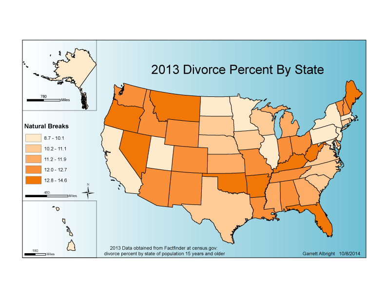
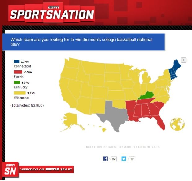
Weekly post: Choropleth Map
 |
| Choropleth map produced by the ESPN show Sportsnation. Very basic map showing percentages of the excitement level per state for the Superbowl. |
Weekly post: Campus Map
 |
| Very detailed guide (probably slightly outdated now) of the PSU campus in State College, Pennsylvania. Since the college is so integrated into the city, it's very important to have a map for students to find their way around. |
Weekly post: Type
 |
| Type Map of the world showing countries composed of their major cities http://www.yardgallery.com/media/world-mape-slate.jpg |
Saturday, November 22, 2014

Tuesday, November 11, 2014


Monday, November 3, 2014
Final Project Proposal
Map subject:
The 12 year breakdown of Penn State football players (by high school, county) they played football at.
Reason why this is my pick:
Most of my family members are Penn State football fans and alumni of the school. I think it would be interesting to map out where the players come from and see the distribution of where they come from.
Map audience:
People who are interested in Penn State football, Penn State alumni, or people who live in Pennsylvania
Type of map envisioned:
Either a dot density map or a choropleth map
Scope of map:
Pennsylvania
Data:
Data was collected from pennstate.scout.com which included the city, state and high school for each player on the team over the last 12 years
Basemap needed:
Pennsylvania shapefile that includes county layer
Expected production steps:
Data collection and organization. The longest step will be taking the high schools and locating them on the map if a dot density map is used. If a choropleth map is made, the players high school locations will have to be organized by county in an excel file.
Challenges you perceive:
Getting players mixed up

Thursday, October 9, 2014


Thursday, September 11, 2014
Weekly Blog Post #2

Tuesday, September 9, 2014

Thursday, August 28, 2014


Subscribe to:
Comments (Atom)